The product configuration takes place through the Configuration Wizard, in which the process of maintaining layout themes, widgets themes, browsers, environment standardization and copying pages takes place. Changes to the parameters are seen in the preview, thus allowing the understanding of each customization.
Note: Only users with admin role or users with permission can access and edit the configuration page. The widgets contained on the page cannot be removed, otherwise the use of the product will be compromised.
What is a Layout Theme?
Layout theme controls top colors, page menus and customization of default widgets (Search, Alert and Profile).
The themes are grouped by categories: Manufacturing, Retail and Services. Our communication professionals evaluated each segment and identified characteristics, which gave rise to standard themes.
The user can change the default themes, or create new themes, through the "Copy" button. We suggest copying the default theme that is more in line with your visual identity.

Through the configuration wizard it is possible to migrate all TOTVS Fluig Plataforma pages (custom and standard) to a Digital Workplace by Digte layout theme.
Where is the layout theme used?
The layout theme can be used on any page with Digte's layout.
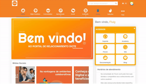
To identify the layout of Digte, just look at the colored borders around the element, as in the example below:

You can choose the layout when creating a new page, creating a community, or changing the layout of an existing page. For example: When choosing the option "Change Layout", you will see several options for page layout, just select the option you want and click "Apply layout".

Layout themes are used when editing pages, and different pages can have different layout themes. For example: The "Home" page has a different layout theme than the "About Company" page

Setting layout theme
Within a theme, the user can change several features, such as: top, menu, page, widgets, slots, footer. While the user is editing, it is possible to see in the preview how the changes will look.

Topic identification:
Code: Theme identification code. It must not be filled with spaces, special characters and capital letters, type only lowercase letters
Name: Enter the name of the created theme
Top and Menu:
Top:
Height: Set a height for your top
Behavior:
Fixed: The top is fixed at the beginning of the page
Track scroll: The top follows the screen scroll
Logo position: Define whether the logo will be left, right or centered
Display logo:
Yes: The logo will appear at the top
No: The logo will not appear at the top
Background color: Choose what will be the background color of your top
Background Image: If you choose to put a background image on top, first insert the image into your ECM and then click on the search field to select the desired image. NOTE: If you place an image it will overlay the background color
Repeat image: Set whether the background image will repeat on top
Horizontal and Vertical Menu:
Enable: Set whether the menu will be enabled
Yes: Enables menu display
No: Disables menu display
Version:
1: Enables the cascading submenu when hovering over pages that have a submenu.
2: Disables the cascading submenu display and enables a functionality that allows you to click on the page button in the menu and replace the entire menu with the items that would be inside the cascading submenu.
Positioning: Set whether the menu positioning
Left: The menu will be on the left of the page
Top: The menu will be at the top of the page
Height: Set the height of the menu in pixels (px). If it will not be filled in, the default value will be 60 pixels (px)
Background color: Set the menu background color
RGBA: Put the code in RGBA
Hexadecimal: Put the code in hex. This code will be converted to RGBA
Background Color (Cursor Overlaid): Set the background color when hovering over
RGBA: Put the code in RGBA
Hexadecimal: Put the code in hex. This code will be converted to RGBA
Marker Color: Set the color of the line below the active page button
RGBA: Put the code in RGBA
Hexadecimal: Put the code in hex. This code will be converted to RGBA
Background Image: If you choose to put a background image in the menu, first insert the image into your ECM and then click on the search field to select the desired image. NOTE If you place an image it will overwrite the background color.
Repeat image: Set whether the background image will repeat in the menu
Do not repeat: The image will not repeat
Right of Widget : The images will repeat only to the right of the top widgets
Below Widget: Images will be repeated only below the top widgets
Both directions: The images will repeat at the bottom and to the right of the top widgets
Text formatting: Define the formatting the texts should have in the menu
Capitalize: The first letter of each word will be capitalized
Lowercase: All letters will be uppercase
Uppercase: All letters will be lowercase
Title Color: Set the menu title color
RGBA: Put the code in RGBA
Hexadecimal: Put the code in hex. This code will be converted to RGBA
Title Color (Cursor Overlay): Set the title color when hovering over
RGBA: Put the code in RGBA
Hexadecimal: Put the code in hex. This code will be converted to RGBA
Title Size: Set title size in pixels (px)
Title Size in Submenu (Version 1): Set the size of titles in Menu Version 1 in pixels (px) - Only in the Horizontal menu
Title alignment in submenu (version 1): Set title alignment - Horizontal menu only
Left: Titles will be on the left
Centralized: Titles will be centralized
Right: Titles will be on the left
Submenu Open Type (Version 1): Define which submenu will open - Only in the Vertical menu
Accordion: The submenu will open downwards
Side opening : The submenu will open on the right side
Icon color: Define what the icon color will be in the menu. NOTE: The chosen color will only be applied to standard icons of TOTVS Fluig Plataforma
RGBA: Put the code in RGBA
Hexadecimal: Put the code in hex. This code will be converted to RGBA
Icon Size: Set the size in pixels (px) of the icons
Icon Color (Cursor Overlay): Set the title color when hovering over. NOTE The color overlay will only be applied to standard icons of TOTVS Fluig Plataforma
Page:
Background color: Set the background color of the page
RGBA: Put the code in RGBA
Hexadecimal: Put the code in hex. This code will be converted to RGBA
Center content: Set whether page content should be centered
Yes: Content is in the middle of the page
No: Content fills the entire width of the page
Width of centered content: Define in pixels (px) how wide the centered content should be
Background Image: If you choose to put a background image in the menu, first insert the image into your ECM and then click on the search field to select the desired image. Recommended size is 1024 x 768 pixels (px) NOTE If you place an image it will overwrite the background color.
Widgets:
Search:
Customize: Allows you to enable customization of the search field
Yes: Enable customization
No: Disable customization
Hide: Hide the component
Curvature: Set the field curvature from 0 to 50
0 stays square
50 is at its maximum curvature, round
Background color: Set the component's background color
RGBA: Put the code in RGBA
Hexadecimal: Put the code in hex. This code will be converted to RGBA
Icon color: Set the icon color (magnifying glass)
RGBA: Put the code in RGBA
Hexadecimal: Put the code in hex. This code will be converted to RGBA
Alert (No notification):
Customize: Allows you to enable customization of the search field
Yes: Enable customization
No: Disable customization
Curvature: Set the field curvature from 0 to 50
0 stays square
50 is at its maximum curvature, round
Background color: Set the component's background color
RGBA: Put the code in RGBA
Hexadecimal: Put the code in hex. This code will be converted to RGBA
Icon color: Set the icon color
RGBA: Put the code in RGBA
Hexadecimal: Put the code in hex. This code will be converted to RGBA
Alert (With notification):
Background color: Set the component's background color
RGBA: Put the code in RGBA
Hexadecimal: Put the code in hex. This code will be converted to RGBA
Icon color: Set the icon color
RGBA: Put the code in RGBA
Hexadecimal: Put the code in hex. This code will be converted to RGBA
Messaging (No notification):
Customize: Allows you to enable customization of the search field
Yes: Enable customization
No: Disable customization
Curvature: Set the field curvature from 0 to 50
0 stays square
50 is at its maximum curvature, round
Background color: Set the component's background color
RGBA: Put the code in RGBA
Hexadecimal: Put the code in hex. This code will be converted to RGBA
Icon color: Set the icon color
RGBA: Put the code in RGBA
Hexadecimal: Put the code in hex. This code will be converted to RGBA
Messaging (With notification):
Background color: Set the component's background color
RGBA: Put the code in RGBA
Hexadecimal: Put the code in hex. This code will be converted to RGBA
Icon color: Set the icon color
RGBA: Put the code in RGBA
Hexadecimal: Put the code in hex. This code will be converted to RGBA
Profile:
Customize: Allows you to enable customization of the search field
Yes: Enable customization
No: Disable customization
Curvature: Set the field curvature from 0 to 50
0 stays square
50 is at its maximum curvature, round
slots
Font: Choose the font to apply to your components. You can only embed fonts from Google Fonts
Space between slots: Define whether there will be space between slots
Yes: The slots will have space between them
No: The slots will have no space between them
Background Color: Set the slots background color
RGBA: Put the code in RGBA
Hexadecimal: Put the code in hex. This code will be converted to RGBA
Background Image: If you choose to put a background image in the menu, first insert the image into your ECM and then click on the search field to select the desired image. Recommended size is 1024 x 768 pixels (px) NOTE If you place an image it will overwrite the background color.
Baseboard
Enable: Define whether the default footer of TOTVS Fluig Plataforma should appear
Yes: Enable the footer
No: Disables the footer
How to use a page layout?
To use a Digital Worplace by Digte layout, and the themes that were created, just follow the steps below:
1) Create a page through the "Control Panel"
2) Choose a page layout that has colored borders, they are layouts from Digital Workplace by Digte
Remembering that after choosing the Digte layout, just follow the normal flow to finish creating your page.
What is a widget theme?
Widget Theme controls the title colors, fonts, borders, background, icons, curls, shadow, and many other branding settings for Digital Workplace by Digte product widgets.
The themes are grouped by categories: Manufacturing, Retail and Services. Our communication professionals evaluated each segment and identified characteristics, which gave rise to standard themes.
The user can change the default themes, or create new themes, through the "Copy" button. We suggest copying the default theme that is more in line with your visual identity.
Where is the widget theme used?
The widget theme is used when configuring the widgets. Different widgets can have different themes, for example: the schedules component has a different widget theme than the birthdays component
Widget themes are independent of layout themes, so you can combine themes from different categories.

Setting up a widget theme
Within a theme, the user can change several resources, such as: title, tools, images, container and much more. While the user is editing, it is possible to see in the preview on the side how the changes will look.
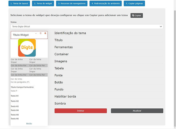
Layout field details:
Topic identification:
Code: Theme identification code. It must not be filled with spaces, special characters and capital letters, type only lowercase letters
Name: Enter the name of the created theme
Title:
Title Position: Define which position the title will be in
Left: The title will be on the left
Right: Title will be on the right
Center: The title will be in the center
Size: Set the title size in pixels (px)
Title color: Set title color
RGBA: Put the code in RGBA
Hexadecimal: Put the code in hex. This code will be converted to RGBA
Background color: Set the title's background color
RGBA: Put the code in RGBA
Hexadecimal: Put the code in hex. This code will be converted to RGBA
Text formatting: Set title text formatting
None: No settings will be applied
Capitalize: The first letter of each word will be capitalized
Lowercase: All letters will be uppercase
Uppercase: All letters will be lowercase
Font: Set the default font for widgets. NOTE: Only fonts that are inside Google Fonts are accepted.
Top Margin: Set the top margin size in pixels (px)
Right Margin: Set the size of the right margin in pixels (px)
Bottom Margin: Set the bottom margin size in pixels (px)
Left Margin: Set the left margin size in pixels (px)
Inner Space (Top): Set the size of the top inner space in pixels (px)
Inner Space (Right): Set the size of the right inner space in pixels (px )
Inner Space (Bottom): Set the size of the bottom inner space in pixels (px )
Inner Space (Left): Set the left inner space size in pixels (px )
Left curvature: Set the title curvature of the upper left corner
Right curvature: Set the title curvature of the upper right tip
Left curvature: Set the left tip title curvature bottom
Right bend: Set the curvature of the right tip title bottom
Enable bottom edge?
Yes : Enables bottom border in title
No: Disables bottom border in title
Border Thickness: Set the border thickness in pixels (px)
Edge style:
None: The bottom border will not appear
Stroke: The border will have the effect of separate strokes
Dotted: Border will have the effect of separate dots
Double line: The border will have the effect of two continuous lines, one above the other
Gradient: The border will have a two-color gradient effect.
Reverse gradient: The border will have the effect of two colors in reverse gradient
Solid line: The border will have the effect of a continuous line
Bottom border color: Set border color
RGBA: Put the code in RGBA
Hexadecimal: Put the code in hex. This code will be converted to RGBA
Tools:
Enable:
Yes: Enable gear, help and minimize tools
No: Disable gear, help and minimize tools
Background color: Set the background color
RGBA: Put the code in RGBA
Hexadecimal: Put the code in hex. This code will be converted to RGBA
Icon color: Set the icon color
RGBA: Put the code in RGBA
Hexadecimal: Put the code in hex. This code will be converted to RGBA
Position: Set the position of the tools
Left: Tools will be on the right
Right: The tools will be on the left
Right Margin (px): Set the margin, in pixels (px), that the tools should get
Enable minimization features:
Yes: The minimize will be shown in the widget
No: Minimize will not be displayed in the widget
Container:
Top Margin: Set the top margin size in pixels (px)
- Right Margin: Set the size of the right margin in pixels (px)
- Bottom margin: Set the bottom margin size in pixels (px)
- Left margin: Set the left margin size in pixels (px)
- internal spacing : Set the internal spacing size in pixels(px)
Images:
Curvature: Set the curvature of images from 0 to 50
0 stays square
50 is at its maximum curvature, round
Table:
Odd row color: Set the color of odd rows in a table
RGBA: Put the code in RGBA
Hexadecimal: Put the code in hex. This code will be converted to RGBA
Even row color: Set the color of even rows in a table
RGBA: Put the code in RGBA
Hexadecimal: Put the code in hex. This code will be converted to RGBA
Source:
Paragraph color (P): Set the color of text in paragraphs
RGBA: Put the code in RGBA
Hexadecimal: Put the code in hex. This code will be converted to RGBA
Link color: Set the color of the links
RGBA: Put the code in RGBA
Hexadecimal: Put the code in hex. This code will be converted to RGBA
Paragraph Size (P): Set the font size of paragraphs in pixels (px)
Text formatting (P): Set text formatting in paragraphs
None: No settings will be applied
Capitalize: The first letter of each word will be capitalized
Lowercase: All letters will be uppercase
Uppercase: All letters will be lowercase
Title Font (H1, H2, H3, H4, H5, H6): Set the default font for titles. NOTE: Only fonts that are inside Google Fonts are accepted.
Title font size (H1, H2, H3, H4, H5, H6): Set the title size in pixels (px)
Title font color (H1, H2, H3, H4, H5, H6): Set the title color
RGBA: Put the code in RGBA
Hexadecimal: Put the code in hex. This code will be converted to RGBA
Titles text formatting ( H1, H2, H3, H4, H5, H6 ): Set the formatting of titles
None: No settings will be applied
Capitalize: The first letter of each word will be capitalized
Lowercase: All letters will be uppercase
Uppercase: All letters will be lowercase
Button:
General:
Title color: Set title color on buttons
RGBA: Put the code in RGBA
Hexadecimal: Put the code in hex. This code will be converted to RGBA
Text formatting : Set text formatting
None: No settings will be applied
Capitalize: The first letter of each word will be capitalized
Lowercase: All letters will be uppercase
Uppercase: All letters will be lowercase
Background color: Set the background color
RGBA: Put the code in RGBA
Hexadecimal: Put the code in hex. This code will be converted to RGBA
Enable edge:
Yes: Enable border on button
No: Disable border on button
Border Thickness: Set the border thickness in pixels (px)
Edge style:
None: The border will not appear
Stroke: The border will have the effect of separate strokes
Dotted: Border will have the effect of separate dots
Double line: The border will have the effect of two continuous lines, one above the other
Gradient: The border will have a two-color gradient effect.
Reverse gradient: The border will have the effect of two colors in reverse gradient
Solid line: The border will have the effect of a continuous line
Border color: Set border color
RGBA: Put the code in RGBA
Hexadecimal: Put the code in hex. This code will be converted to RGBA
Button curvature: Set the curvature of images from 0 to 50
0 stays square
50 is at its maximum curvature, round
Navigation button:
Color: Set the button color
RGBA: Put the code in RGBA
Hexadecimal: Put the code in hex. This code will be converted to RGBA
See more button:
Title color: Set title color
RGBA: Put the code in RGBA
Hexadecimal: Put the code in hex. This code will be converted to RGBA
Icon color: Set the icon color
RGBA: Put the code in RGBA
Hexadecimal: Put the code in hex. This code will be converted to RGBA
Background:
Color: Set the widget background color
RGBA: Put the code in RGBA
Hexadecimal: Put the code in hex. This code will be converted to RGBA
Repeat image: Set whether the background image will repeat in the menu
No repeat: The image will not repeat
Right of Widget : The images will repeat only to the right of the top widgets
Below Widget: Images will be repeated only below the top widgets
Repeat both: The image will repeat in both directions
Track scroll:
Track scroll:
Fixed:
Widget background image behavior:
Original: The image will be in the original size
Fit: The image will fit the screen size
Expand: The image will expand to cover all screen spaces
Image: If you choose to put a background image in the menu, first insert the image into your ECM and then click on the search field to select the desired image. NOTE If you place an image it will overwrite the background color.
Image Position: Set the position the image will be
Top: Focus will be on top of image
Right: Focus will be on the right part of the image
Bottom: Focus will be on the bottom of the image
Left: Focus will be on the left part of the image
Centered: Focus will be on center of image
Enable edge:
Superior and inferior:
Thickness (px): Set the border thickness in pixels (px)
Edge style:
None: The border will not appear
Stroke: The border will have the effect of separate strokes
Dotted: Border will have the effect of separate dots
Double line: The border will have the effect of two continuous lines, one above the other
Gradient: The border will have a two-color gradient effect.
Reverse gradient: The border will have the effect of two colors in reverse gradient
Solid line: The border will have the effect of a continuous line
Color: Set the border color
RGBA: Put the code in RGBA
Hexadecimal: Put the code in hex. This code will be converted to RGBA
Left Curvature: Set the Curvature of the Edge in Pixels (px)
Right Curvature: Set the Curvature of the Edge in Pixels (px)
Right and left:
Thickness (px): Set the border thickness in pixels (px)
Edge style:
None: The border will not appear
Stroke: The border will have the effect of separate strokes
Dotted: Border will have the effect of separate dots
Double line: The border will have the effect of two continuous lines, one above the other
Gradient: The border will have a two-color gradient effect.
Reverse gradient: The border will have the effect of two colors in reverse gradient
Solid line: The border will have the effect of a continuous line
Color: Set the border color
RGBA: Put the code in RGBA
Hexadecimal: Put the code in hex. This code will be converted to RGBA
Shadow:
Right of widget: Set how far to the right the shadow will be, the size is counted in pixels
Below the widget: Set how far below the shadow will be, the size is counted in pixels
Blur Effect: Set the amount of blur in pixels
Shadow Advance Size: Set the size the shadow should advance
Color: Set the shadow color
RGBA: Put the code in RGBA
Hexadecimal: Put the code in hex. This code will be converted to RGBA
When all modifications are finished, click on "Update"
Browser Features
In the "Browsers Resource" tab you can mess with logos, favicon and background.

Soon
The logo is the image used on the login screen and at the top of the page
Choose file: Lets you choose a file right from your computer
Recommended height: 60 pixels (px)
Recommended width: No limit
Format: The image must be .png
favicon
O is the image displayed in the browsers tab or in the browser's favorites screen
Choose file: Lets you choose a file right from your computer
Recommended height: 32 pixels (px)
Recommended width: 32 pixels (px)
Format: The image must be .ico
Background
Choose file: Lets you choose a file right from your computer
Recommended height: 1024 pixels (px)
Recommended width: 768 pixels (px)
Format: The image must be .png
"X": Allows you to remove the background image
Standardization of the environment
In the "Environment standardization" option, you can apply the layout theme built in the previous steps to all TOTVS Fluig Plataforma pages

Theme
Select the theme you want to apply to all pages
Apply button
By pressing "Apply" the theme will be applied to all platform pages. NOTE: This process can take a few minutes, as it applies the layout theme to all TOTVS Fluig Plataforma pages
Reset button
Removes the layout theme from Digte and returns to the default theme of TOTVS Fluig Plataforma
Setting up communities
These are pages that have all collaboration treatment.
When creating a community, it will automatically be created with the classic TOTVS Fluig Plataforma theme, and to allow the use of Digital Workplace by Digte widgets, it is necessary to change the layout to Digte's.
Remembering that Digte's layout has colored borders, like the image below:

Follow the path below to change the layout of a community:
"Your Community" > Profile Picture > Edit Page > Profile Picture > Change Layout

When choosing the "Change layout" option, just click on the desired layout and click on "Apply"
Through the configuration wizard it is possible to migrate all TOTVS Fluig Plataforma pages (custom and standard) to a Digital Workplace by Digte layout theme.
During the installation process of Digital Workplace by Digte, a folder called “Communities” is created, which we recommend using to centralize the contents (documents, forms, articles, videos, images) of your communities. NOTE: Importantly, each community must have its own folder structure.
configuring menu
The TOTVS Fluig Plataforma menu with Digital Workplace by Digte now has new features such as:
1) Icon exchange;
2) Change of order of pages;
3) Inclusion of new icons, which are not part of TOTVS Fluig Plataforma's arsenal
4) Links pointing to external pages, outside the platform
This customization takes place via the configuration form, located at: Intranet by Digte > Registers > Menu Customizations

Choose the page you want to configure and click "Edit".

Additional menu?
Yes: Indicates that it is not linked to an existing page on TOTVS Fluig Plataforma and will allow access to a URL directly
No: Indicates that it will replace the settings of an existing page in TOTVS Fluig Plataforma
Page code: Enter the code generated at the time of page creation. This code is usually inserted in the page's URL, for example "https://portal.digte.com.br/portal/p/digte/digte-academy", the page code is "digte-academy"
Open a new tab?
Yes: When you click on the page it will open in a new tab
Not: When clicking on the page it will open in the same tab
Title (Portuguese, English, Spanish): Configure the title of the page that will be displayed in the menu. You configure for Portuguese, English and Spanish.
Sequence: Define in which sequence the page will be displayed in the menu
Icon: Choose an icon to be displayed along with the title in the menu. NOTE: These icons are only from the TOTVS Fluig Plataforma arsenal
Link: Insert a link if you want the redirection to an external portal page
Image url: When inserting an image in your ECM you can generate a link, through this you can add your own icon
Image of documents: Insert the image into your ECM, then click on the magnifying glass and look for the icon you want to display in the menu
Width and Height: Set the width and height your icons will be in pixels (px)
When finished click on "Save".
Page forms, widgets and layout
Digital Workplace by Digte, by default, updates the Pages, Widgets and Layouts forms, for this reason we recommend that you do not manually change the form. If this happens, there is a risk that your environment will get some malfunctions.
The following folders store forms that should NOT be edited manually.
As of the update of 01/21/2020, in the new Empower version of Digital Workplace by Digte, a registration center was made available. What was previously necessary to go to the GED to be done, will now be used in the new center. There are two ways to access this new center:
1) By clicking on the widget gear:
By clicking on the widget gear, the user is directed to the "Registers" page and the corresponding form of the pre-selected widget.
2) By clicking on the "Registers" page in the menu:
By following the path: Intranet by Digte > Registers you will be able to access all forms from all widgets
Watch the video for further clarification: